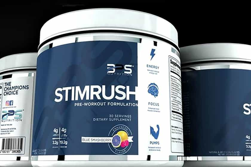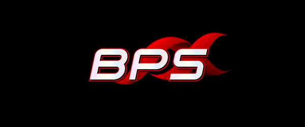
Body Performance Solutions fans will have noticed over the past few months the brand haven’t themed their supplements the same way they did the likes of DCP, Vanillean and EndoSurge Turbo. The brand better known as simply BPS have been giving their latest efforts colorful graphics behind their titles, which you can see in products such as Combustion and AdrenoSurge. The brand are now looking to update their labels even further with an entirely new logo. Today BPS have shown off a very different symbol, dropping their gradient infused block letters for a similarly italicized modern type, and a new vector graphic floating in the background as opposed to the original’s swirl that would sit to the right. BPS have previewed the 2015 logo in both white outlined in red on black, and black outlined with red on white, giving fans a preview of what it’s going to look like in different situations. The brand have said the updated graphic is coming soon, with no exact word on when we’ll be seeing it on supplements or in advertisements, just that it’s on its way.


