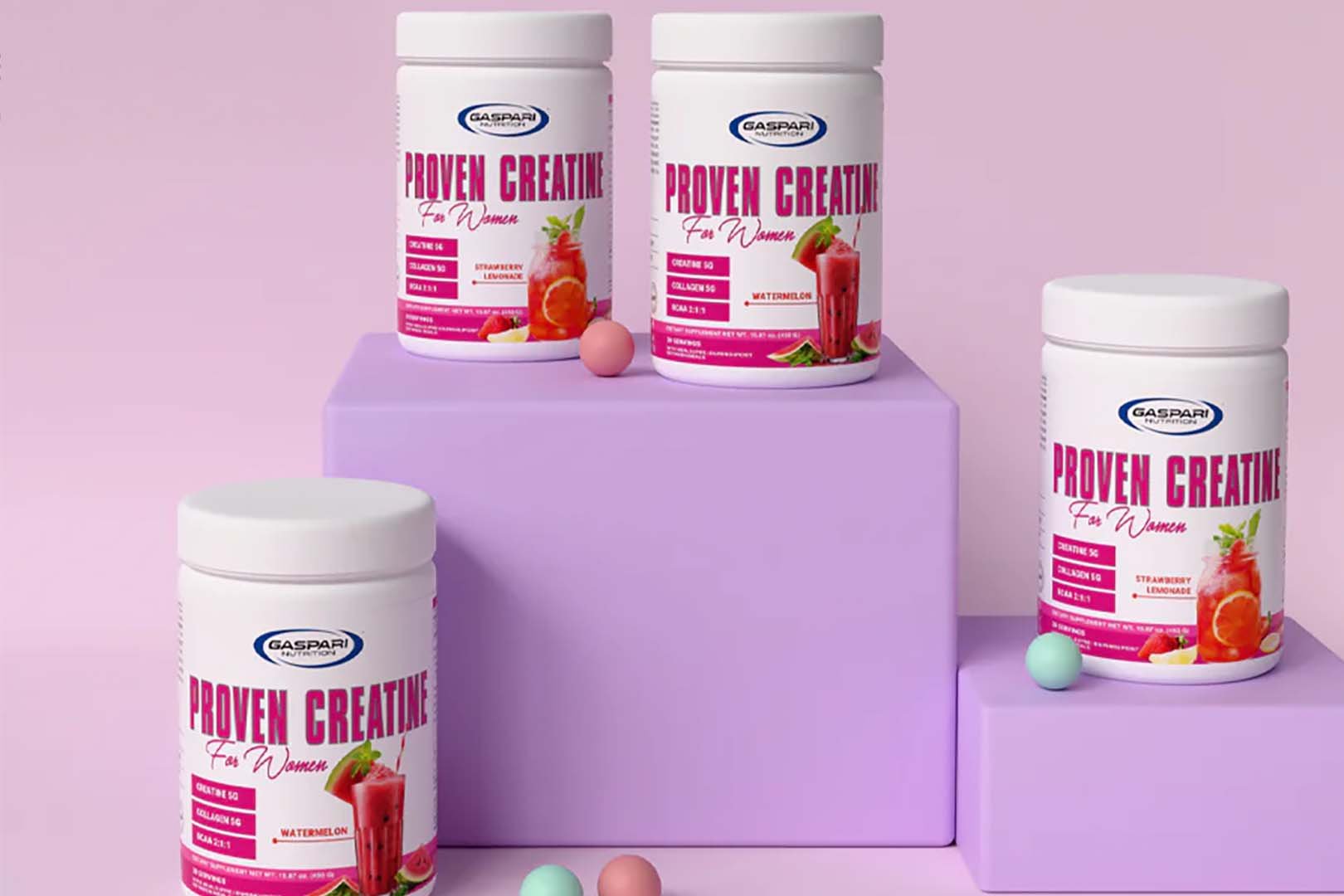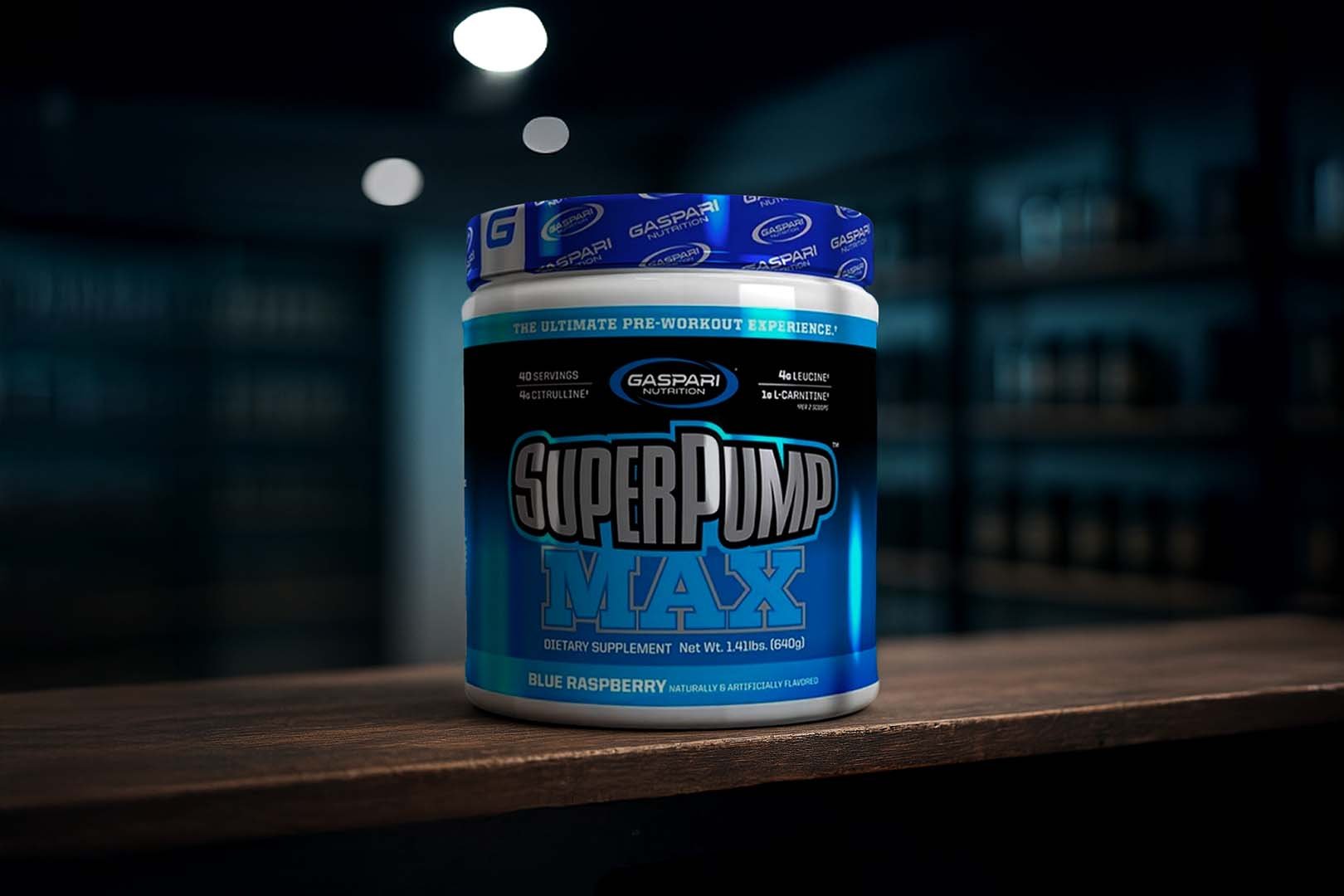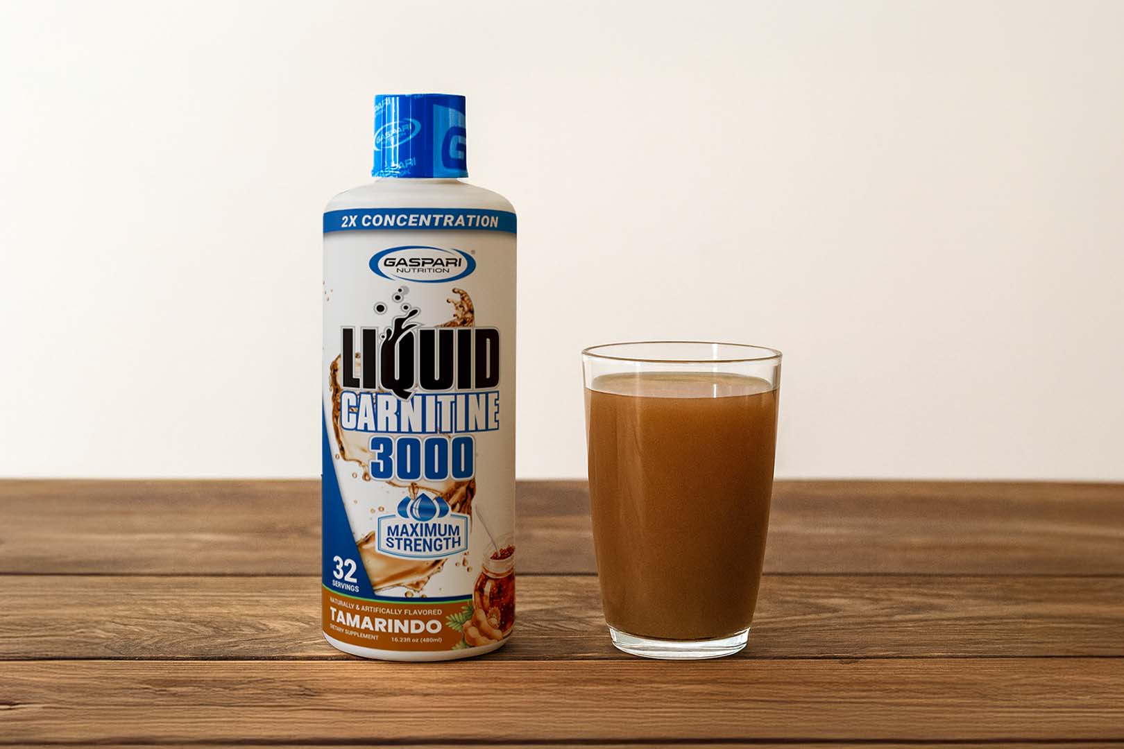
Gaspari Nutrition said that a rebranding was coming, which initially we did think was a bit soon since it seemed like they only just went from the black and blue, to the more modern white with a touch of blue. We did end up doing a bit of research and it does turn out the brand’s current look does date back to early 2013, roughly two years ago. As short as that still is, Gaspari have got an update coming which visitors of the LA Fit Expo will be getting a glimpse of this weekend. While the brand haven’t got any of their supplements dressed in new labels, they have got a fresh new logo on display. Compared to their previous graphic Gaspari have maintained their circular shape made up of two curved ends, with the brand’s iconic name in the middle of it all. Like with most logo changes Gaspari have decided on a different font going with a much more technological feel and keeping the tradition of “Gaspari” being bold and “Nutrition” thin. As well as showing off their new logo, the brand have also revealed an initials variant combining the letters “GN” for a very iForce like signature. You can see both Gaspari graphics in the image above, and no doubt in the brand’s promotional material in the near future.


