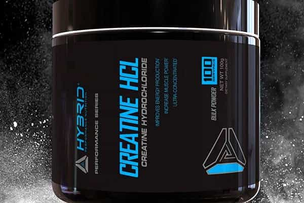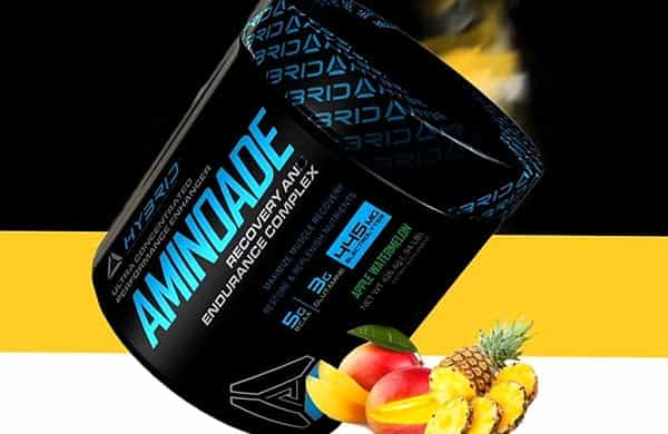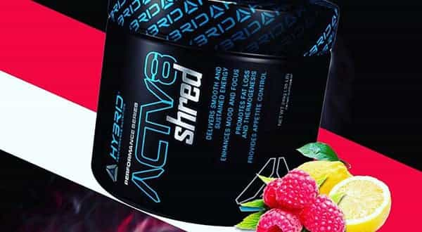
Hybrid Nutrition said they had a lot of new things coming and that is exactly what they have dropped a sneak peek at today. As well as a bunch of new products that we’ve yet to get any details on, it turns out the brand have also put together a bit of a rebranding. While the image they’ve released isn’t exactly high resolution, you can see above that Hybrid will be dropping their signature black, red and stylish background graphics. The colors fans will need to get used will be black and blue, and an entirely new logo as the brand will be throwing away their block letter title for a slimmer more minimalist font. As exciting as Hybrid’s updated look appears, they are promoting the idea of innovation and new supplements more than anything. The brand are describing their major move as the next generation of Hybrid, but are also saying they’ll only be keeping “some of the products you already love”. With the introduction of more it seems some of the brand’s current formulas will be left out, making the next few months something Hybrid fans will want to watch as well as the industry if the brand prove to be as innovative as they’re promising.


