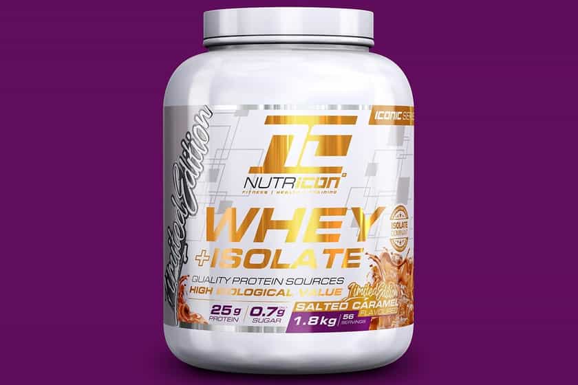

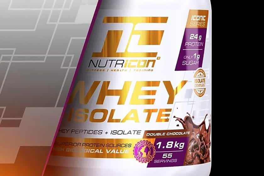
Nutri-Con is another up and coming brand from the emerging South African sports nutrition market, which has some big news to share for 2020. For the new year and new decade, the company is rebranding its entire line of supplements and is switching to a significantly different look that most notably drops its mostly purple color design.
You can see Nutri-Con’s fresh new branding in the image above, which still comes with bits of purple, but is primarily white, with gold accents and touches, giving it a more premium feel. The white and gold is going to be used on most of the brand’s products, while some of its more complex supplements will have a contrasting black and gold theme.
The rebranding is a major change for Nutri-Con, as mentioned, with fans needing to get used not seeing the purple being so dominant on the brand’s labels. Nutri-Con plans on rolling out the new looks in the coming months, although for now, it is running a huge clearance sale on its website, offering a strong discount on its previous products.