
Australian sports nutrition brand Switch Nutrition launched back in the first half of 2017, has maintained its original look throughout its many years on the market. The brand has built a strong name in the industry with some well-put-together and reliably effective supplements, such as the balanced, stimulant pre-workout Power Switch and one of the earliest general relaxation products, Adrenal Switch.
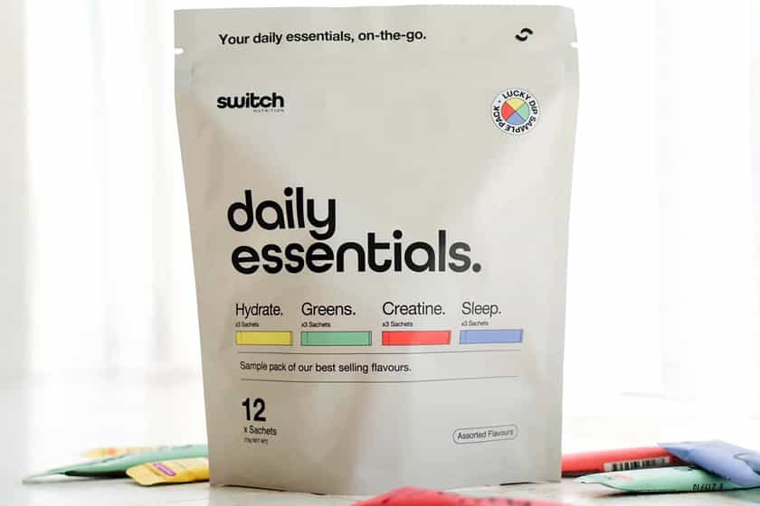
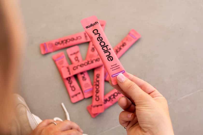
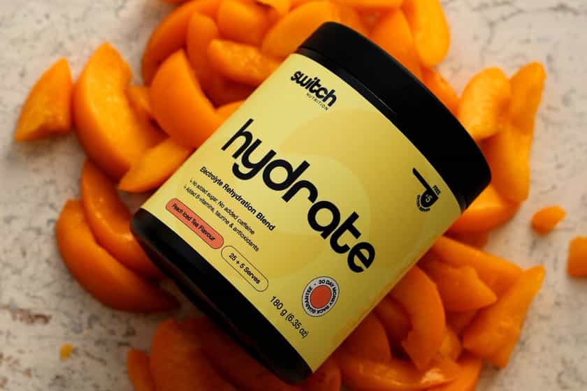
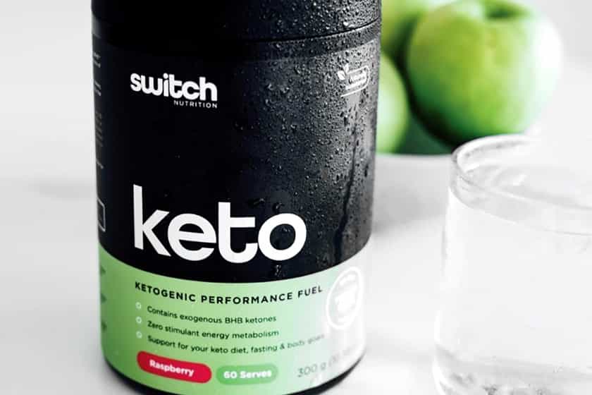
For 2022, a little more than five years of being out there, Switch Nutrition is changing the look of its reputable family of supplements, although not by a lot. You can see the sports nutrition company’s new branding in the image above, which maintains its signature split of black on top and color at the bottom. The key informative features have also remained in the same areas, including the product titles dead center.
The most notable difference in Switch Nutrition’s first major rebrand is the font used for its logo, the names of supplements, and the various other details filling out the labels. The brand has moved to something a little more smooth, modern, and curved, as opposed to the straight-cut lines and harsh edges of its previous look.
Switch Nutrition’s website has already been updated to reflect the new branding, but again, the change is relatively subtle compared to many of the other rebrands we have seen. That signature color split, the single colors for each of the products remaining pretty much the same, and the details all being laid out similar, gives the new look a high level of familiarity and, at the same time, a refreshed feeling.