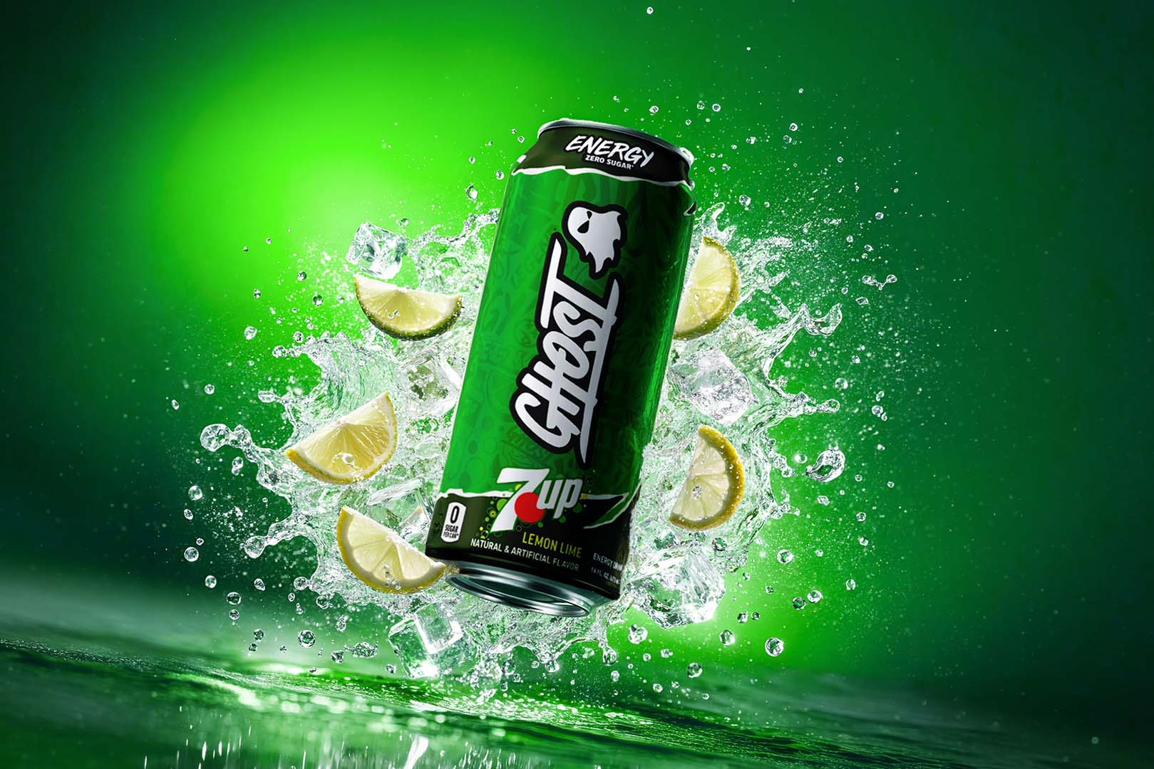
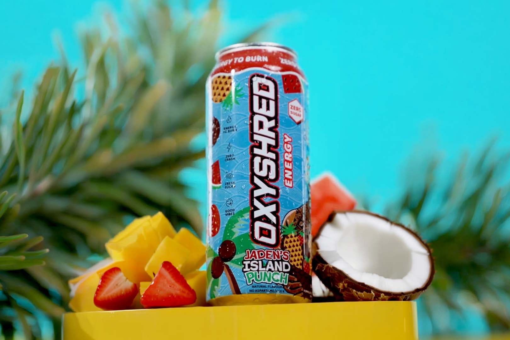
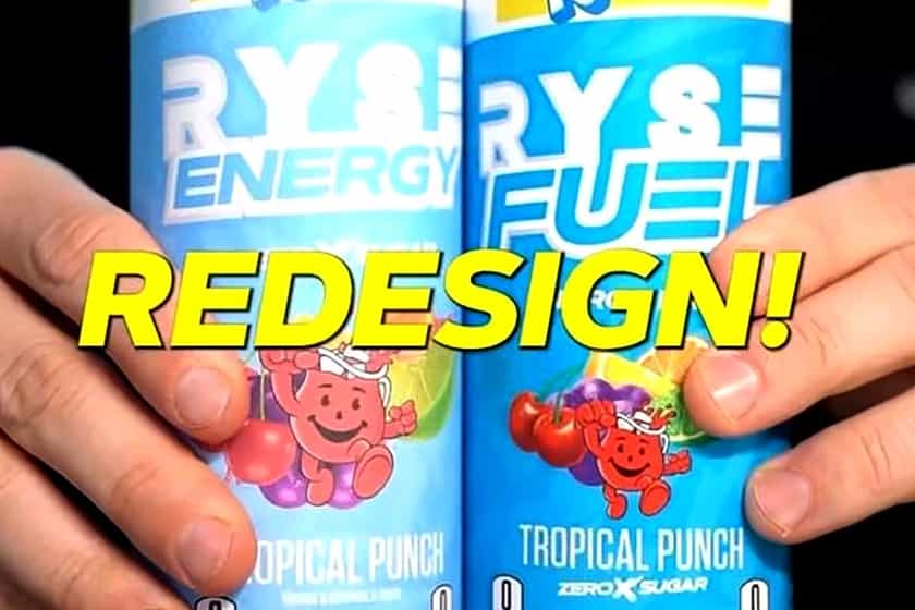
Overall Brand Of The Year and Energy Drink Brand Of The Year nominee RYSE has announced it is changing the look of its still very fresh and new RYSE Fuel energy drink for a better presence on shelves. If you’ve seen the product, you’ll know that, like many competitors in the space, the brand runs its logo down the can vertically, which is also what EHP’s OxyShred Energy, Redcon1 Energy, and Ghost Energy do.
In gas stations, where the RYSE Fuel energy drink is heavily stocked and sold, the bottom half of that logo is cut off, so in an effort to make its name more clear and obvious, it is rebranding the product. RYSE is currently deciding between two designs, both of them can be seen above, where the brand has switched to a horizontal display with the title running from left to right and sitting well above halfway for better visibility.
An interesting difference between the two potential rebrands for the RYSE Fuel energy drink is one says “RYSE Fuel” and the other “RYSE Energy”, so this could be both a rebrand and rename. Other than that, the information displayed and layout of features is very similar between the two, although at the same time, quite different from the original look of RYSE Fuel, where there is more focus on the flavor and slightly less open space.
RYSE is actually asking fans to help it decide which of the two rebrands it should go with for RYSE Fuel energy drink, with the RYSE Energy one obviously bringing with it a change in name. To have your say and let the brand know the direction you’d like to see it take, head over to the RYSE or RYSE Fuel Instagram pages and comment on the redesign post.