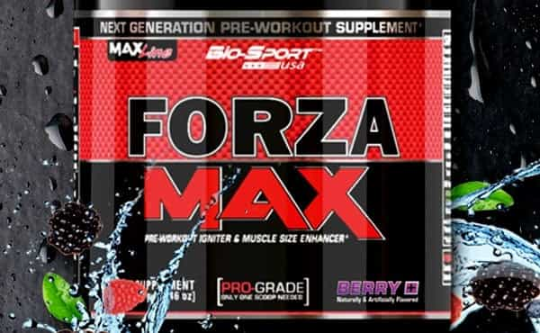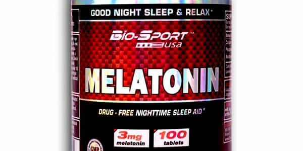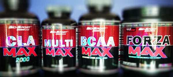


While it’s not uncommon for a brand to update their website whether it’s making a few edits to the design, layout or even an entire makeover. Very rarely do we see major changes, and by that we mean a whole new look and feel. This week Biosport have done exactly that, almost earning themselves the title of most improved website. That’s not to say their updated version is ground breaking in any way, just that it is a massive leap from their previous one. Biosport now actually have a much more spaced out layout making it a whole lot easier to take everything in, a nicer navigation bar, brighter colors, sharper graphics, and a design that remains consistent going from page to page. The most impressive change is definitely the colors and graphics, as even though they’re similar the upgraded site displays them so much better than before that you think it’s an all new look. To check it all out you can find the website at the same address, biosportusa.com.