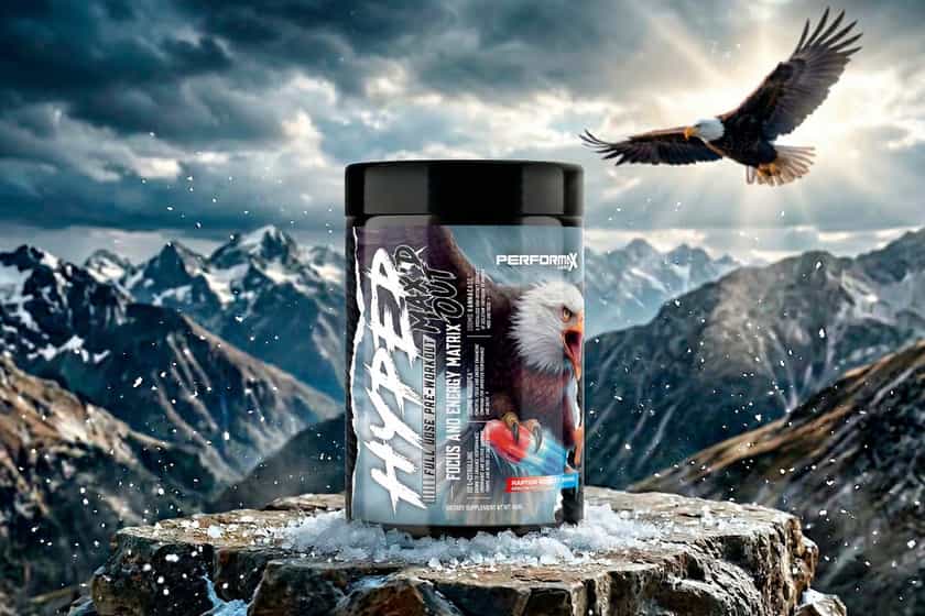


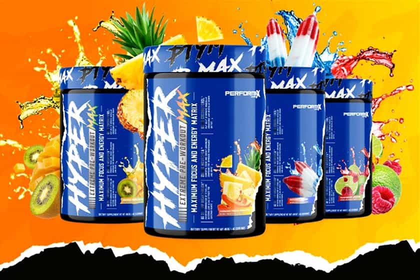
Reputable and top-rated brand Performax Labs has unveiled its exciting new look, which is a crucial part of the “something big” it’s been teasing over the past few weeks. You can get a complete look at the refreshed branding the supplement company has been working on for the past year or so above, and as you can see, it is quite a shift from anything it’s done previously.
Performax Labs has dropped its formal layout and simple display of information for something a lot more intense and hardcore. The titles of each product now have a strong, eye-catching font, the brand’s vibrant blue is used a lot more throughout the label design, the flavor callouts are much bolder, and it’s all outlined with a paper tearing graphic as a nice finishing touch.
The branding is a lot more fitting for Performax Labs’ intense, hardcore, and effective supplements, something it says it was trying to achieve. The brand has previewed the new look on the reformulated version of its previously number one-rated pre-workout HyperMax, which is launching in the coming weeks and months, and will be the first product wearing the new look.