Very rarely do big brands of any industry give consumers a peek behind the curtains of development and innovation, but it is incredibly interesting seeing what goes on behind the scenes. Ideas that never get past the concept stage, flavors that don’t pan out, or even branding and design that is turned down. The energy drink giant Monster has done that regarding its recently released and deliciously on-point Ultra Wild Passion.
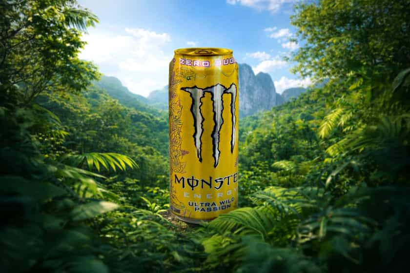
When the name of the Ultra Series extension was revealed in the passion fruit-based Ultra Wild Passion, we were thinking it would either be some sort of purple tone or a yellow, maybe gold, two sorts of colors commonly related to the food. Monster did go with a pale purple and touches of beige; however, it did test out the idea of a yellow or slight gold with that aluminum can backing, as you can see in the mocked-up draft above.
Monster found that the alternative yellow design didn’t test out as well as the purple with audiences, so it eventually went with the latter. Either way, it’s great to see what could have been, to the extent that Ultra Wild Passion was presented in that colorway.
