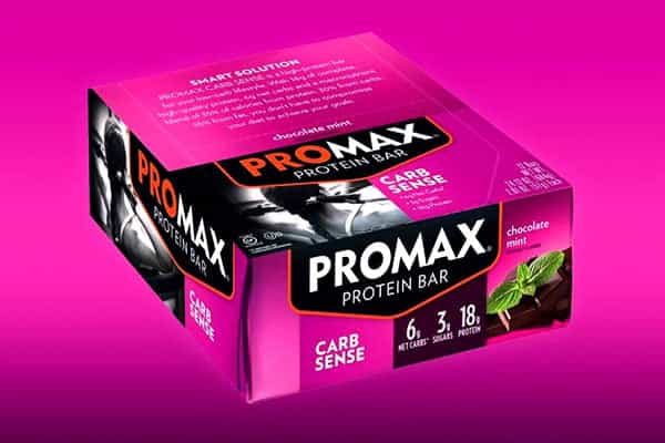


Promax already had a well presented website, with a strong display design and easy to navigate layout. However the brand have seen fit to revamp their online presence with a completely new theme. The updated site still holds on to the previous version’s up front feel and arrangement of graphics, but with a bit more of an informative push. While the last design did get the job done, it was a bit direct. Interested people and fans of Promax were forced to really just get in, look at their products, and go. Leaving other important parts about the company unfocused. Which coincidentally they have not done this time around. On top of the new colors and traditional layout, Promax have included a store locator, news section, athlete profiles, and a wholesale login page, all presented as important as the supplement range. If you would like to view the new website and all it’s updated areas, visit them here.