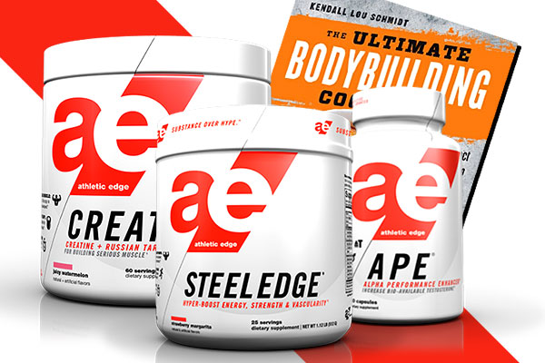
Today Athletic Edge Nutrition have released a small taste of what fans are about to be treated to when they said they had something big coming. Last time we talked on the topic we had almost nothing to show, just the promise of a major rebranding, updated supplements, and an entirely new pre-workout we’re still not sure if it will be a sequel or replacing the long standing Pre Surge. The taste Athletic Edge have given is the image above unveiling their new logo, making a massive leap from the old circular, much more self explanatory icon. While we don’t overly appreciate the font the brand have used, which doesn’t leave the logo a lot of character, the design has to be one of the better ones we’ve seen. The simplicity of the graphic is incredible, and makes it look like there is an entirely new mind, team and strategy behind Athletic Edge. The symbol also drops any obvious sign of the letter “N”, further confirming something we’ve noticed the brand have been hinting at, being referred to more by the name we call them Athletic Edge, without “Nutrition” at the end or as AEN. Overall it really is a straight simplistic approach for the brand, from the small yet identifiable logo to the possible title shortening resulting in just Athletic Edge. More information is of course on the way as we get one week close to the brand’s launch of sometime in April.