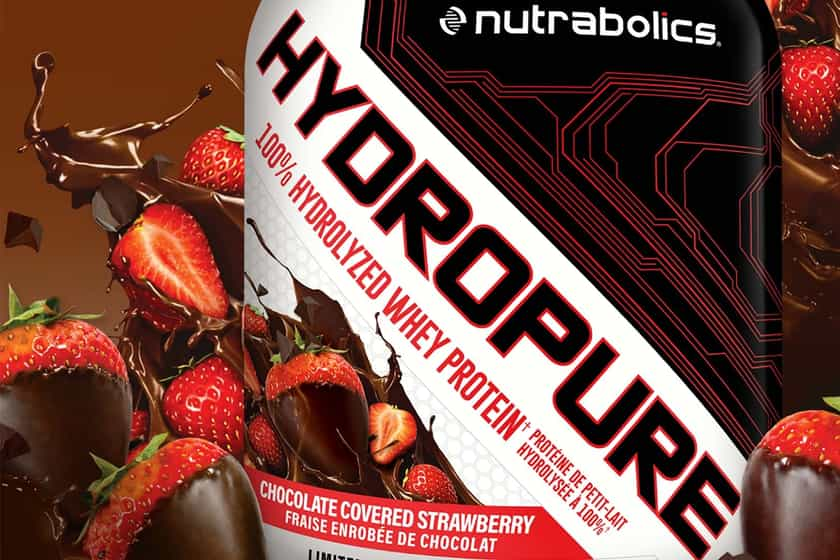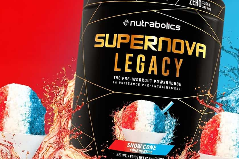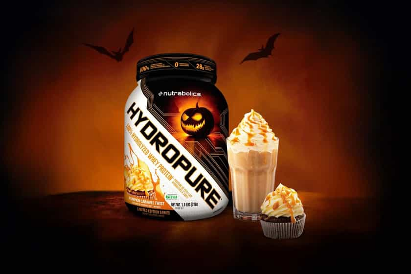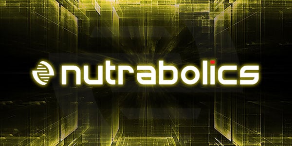
At a time where a number of supplement companies are rebranding their ranges and switching out their logos, Nutrabolics have joined the list with a rather big change for them. The move is being referred to as stage one which is introducing the brand’s new and very different logo. Nutrabolics have maintained their lowercase letters for the updated graphic, although decided to go with a new font carrying a little more character than their last. Also with the wording comes an icon that you can see above to the left of the logo, something as long we’ve known Nutrabolics they’ve never actually had. Whether or not they’re going to use the symbol to represent them without the need for the text we will soon see, as in a few months time Nutrabolic’s will also be dropping their branding to match. While we haven’t got any sneak peeks at the redesigned labels. With the neon yellow patterns and shapes in the background of the brand’s updated logo image above, we do get a bit of a hint as to what direction they may be going in suggesting a bit more color and complexity. Like most, Nutrabolics are saying you will be blown away by their new look, which will be interesting to see how it turns out as their current theme is already one of the better ones out there.
