
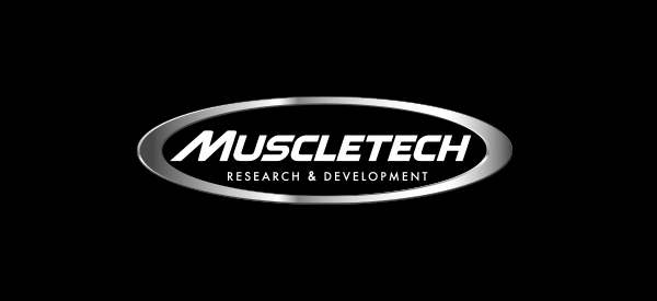
Muscletech, one of the most well known supplement companies on the market. Have made a change to their logo, that quite honestly could be a bigger branding transformation than the Ultra Hardcore Pro to the Performance Series. Their current symbol, which can be seen everywhere Muscletech is, dates back longer than we care to remember. Yes, over the years it’s colors have changed with a black and white, complete chrome, semi chrome, and of course the unforgettable original rainbow variant. However, the core image has not changed, seeing the brand keep their signature oval, short phrase ‘Research & Development’, and somewhat consistent semi-condensed and oddly proportioned sans serif font. Of those three key features, Muscletech have kept on board two for their new logo. Replacing for the first time in a long time their font, with a much more modern, italicized, and balanced out style. For now the updated emblem can only be seen on Muscletech’s American website, no products from what we know, or social media. The modification of the Muscletech symbol appears to be only quite a recent development. One that we actually believe brings a fresh new feel to the brand, and also gives us the sense that it could be bringing a new wave of supplements.
