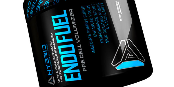
We recently got a sneak peak at Hybrid Nutrition’s upcoming rebranding that the brand said would be the look of their next generation movement. As pixelated as the sneak peek was, it gave us a lot of information with the main thing being Hybrid’s switch from black and red to black and light blue/cyan. The brand have now uploaded an even closer look at their 2015 makeover, and this time we do get complete and clear shot of it. While we already thought the blue of the logo was light and bright, as you can see in the image above of Hybrid’s updated End Fuel, things get even lighter in other areas of the label. Also prominently featured on the bottle is a triangle like graphic which is the brand’s introduction of a symbol logo. As well as being displayed as large as the title of Endo Fuel, the triangle is again used next to Hybrid’s name further confirming the symbol representation. According to the brand the addition to the logo represents their quest for improvement, something they’re really focusing on for their next generation movement and all the products it’s expected to bring. As exciting as the new packaging is, like most fans we are more interested in seeing what Hybrid have put together in terms of supplements, something we’re likely to get a look at next now that the rebranding reveal is out of the way.
